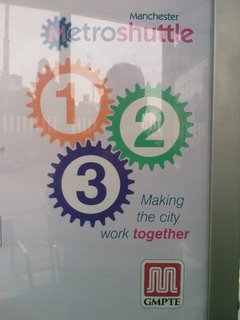
A classic example of poor visual communication - what's wrong with this picture?
 Take a look at the picture on the left. It is a poster for the Manchester City Metroshuttle.
The poster was clearly commissioned by the City to help publicise the work that the Metroshuttle is doing in helping to ease congestion and get people to their destinations with greater ease.
In that sense, the message was intended to communicate (visually) 'We're making the city work better by making all the parts work together'
Not a bad poster for that message is it? OR, is it!? Take another look...
What's wrong with this picture.... Well, a simple understanding of physics would tell you that if cog 1 turned cog 2, cog 3 would be shredded and destroyed! You see if cog 1 goes clockwise, cog 2 goes anti clockwise, but since cog 3 is connected to BOTH cog 1 (clockwise) and cog 2 (anticlockwise) it will be stressed from both directions and simply destroy the mechanism....
So, perhaps the slogan should read 'Destroying the way the city SHOULD work together'...
Another classic example of poor visual communication.... Now, I'm sure many of you are saying 'So what', 'most people won't even notice the anomaly!' Well, I did! And all it takes is one person to post a picture to their blog, have it spread throughout the internet and.... Well, you get the picture (sorry for the pun)!


 .
.
 .
.

1 Comments:
The MetroShuttle cog is also on its lonesome at the top, suggesting that while the city is busy destroying itself, the MetroShuttle is merrily turning away in splendid isolation!
By Paddy, at 4:24 PM
Post a Comment
<< Home